Project Description
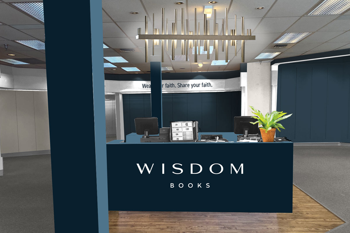
A long-time client showed up at the design firm one day stating that he was—at the age of 79—opening a bible book store called Wisdom Books and he needed branding.
With a name like Wisdom, a dark navy blue was the natural choice to communicate confidence, wisdom and truth. But navy alone had a “nautical” feel so we added a bright, cheery green to communicate “growth”, a coral-red known as “hibiscus” to communicate “warmth and leadership” and finally, sky blue and white for “purity”.
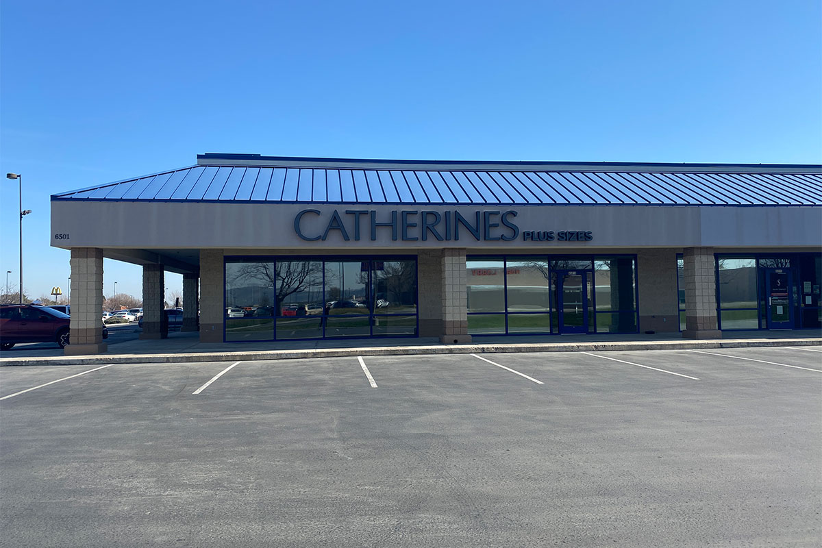
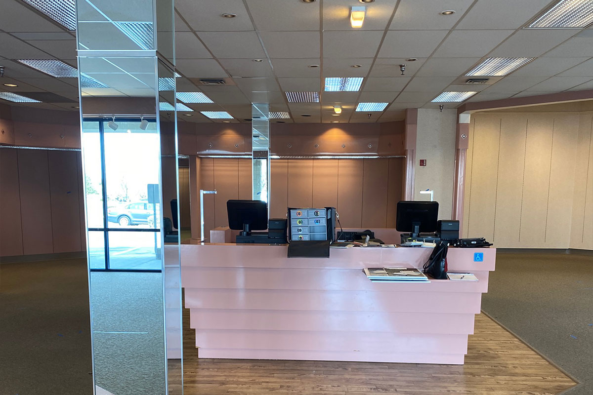
Next, Mr. Wisdom (that is his real name) needed help envisioning signage, and interior and exterior renovations and paint colors. Using photos of the existing building, I photoshopped in the new color palette and signage so that he could visualize the recommendations and see that the existing cobalt blue window trim did not have the same level of sophistication the dark navy.
And finally, I created a “paint by number” rendering so that the painting contractor would know exactly which color and finish (I.e., matte, gloss, satin) went in which location.


Leave A Comment